

Sign In to Your Account
Subscribers have complete access to the archive.
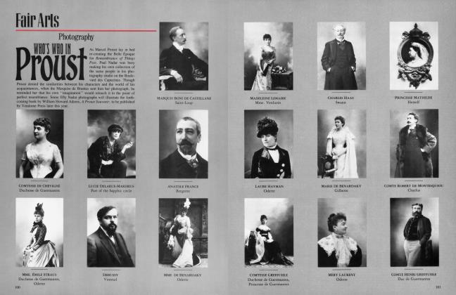
Sign In Not a Subscriber?Join NowMoMA LOSES HER MODERNITY
Fair Arts
Architecture
IT often seems as if the architects designing new museums have deliberately set out to dominate the art on view. Now, with museums being built or added onto in New York, Dallas, Los Angeles, London, Paris, and Stuttgart, the issue of container versus contained looms as a subject of intense debate among curators and architects.
However, the opposite of the overdesigned architectural artifact is also prevalent. There are many new museums where it is hard to find any “architecture” at all. New York’s Museum of Modern Art, reopening this month after renovation and expansion by Cesar Pelli & Associates (in conjunction with Gruen Associates), is a stunning case in point. The institution that brought modem architecture to the American public’s attention in the ’30s with its landmark exhibitions, its creation of the first architectureand-design department in a museum, and the construction in 1939 of its own International Style quarters—all taut, brittle, crisp-edged planes—now offers blandness and boredom in its newly remade facilities. The Modem no longer looks like the harbinger of the future: it is the entombment of the established present.
The old, 1939 edifice, whose facade has been retained, was designed not by an acknowledged master of the modern movement, such as Mies van der Rohe, but by a more staid American architect, Philip Goodwin, and an enthusiast of the new, Edward Durell Stone. Though the building was no drop-dead architectural achievement, its look was nevertheless startling. As Lewis Mumford commented when the museum opened, “there is nothing to identify the new Museum of Modern Art as a museum. There are no classic columns or cornices; the place does not look like a temple or a palace. The building belongs. . .visibly to our day.” Commending the Modern on its unity of exterior and interior design, Mumford also praised its airy openness.
Although it didn’t seem so then, the loft-size floors were actually quite intimate. MoMA’s very plain galleries did have character. The spaces were open enough to be flexible, yet small enough to keep visitors from feeling as though they were caroming about in a cavernous storage bin. Initially, natural light was integral to the design. In the original building a translucent window wall subtly admitted light to several galleries and the circulation space facing south, while in the rear, glass brick and skylights allowed light to enter into the exhibition halls.
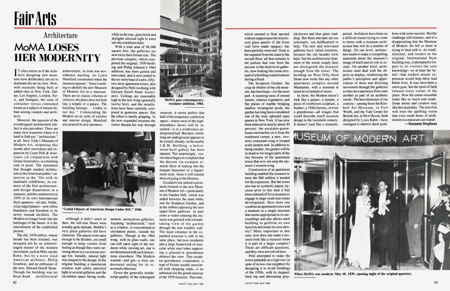
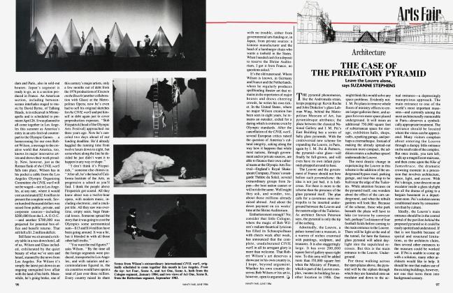
With a total area of 98,000 square feet, the galleries are now twice their former size. The previous complex, which comprised the original, 1939 building and Philip Johnson’s 1964 addition, has been gutted and renovated, and is now joined to the six-story base of a new, fiftytwo-story apartment tower, also designed by Pelli (working with Edward Durell Stone Associates). Ceilings are reasonably high in the new wing (generally twelve feet), and the installations have been carefully composed in generous spaces. But the effect is hardly gripping. In the now expanded museum the visitor threads his way through neutral, anonymous galleries. Anything “architectural,” such as a window, is concentrated at circulation points, outside the galleries. Though in the 1964 wing, with its glass walls, one can still catch sight of the outdoors while viewing art, one is not threatened with such distractions elsewhere. The Modern wanted—and got—a truly understated setting for its renowned collection.
Given the generally nondescript quality of the redesigned museum, it seems perfect that half of the temporary-exhibition space—where most of the highattendance shows will be installed—is in a windowless underground hall. But then, exhibiting art underground appears to be a trend: already, in the nearby I.B.M. Building, a belowstreet-level gallery has been opened. Not surprisingly, visitors have begun to complain that the descent via escalator reminds them of sinking into the bargain basement of a department store. Soon it will remind them of going to the Modem.
Escalators are indeed a prominent element in the new Museum of Modem Art—particularly in the Garden Hall, which was added between the main lobby and the Sculpture Garden, and in the lobbies adjoining the new upper-floor galleries. In past years a visitor entering the museum was greeted with a breathtaking view of the garden through the rear window wall. The main entrance to the expanded museum is still in the same place, but now escalators and a large framework of muscular white steel tubes supporting a glassed-in greenhouse obstruct the view. This escalator-greenhouse component, a type of fixture usually associated with shopping malls, is no substitute for the grand stairway of the 1939 museum. That stair, which seemed to float upward without support past the translucent glass panels of the front wall (now made opaque), has been partially removed. Gone is the segment from the main to the second floor; all that remains is the portion that rose from the secondto the third-level galleries, now looking like some remnant of a building washed ashore during a flood.
The Sculpture Garden, the coup de theatre of the old museum , has been kept—for the most part. A stunning oasis of rotund statues, sinuous vegetation, and flat planes of marble bridging shallow rectangular pools, the garden has long been considered one of the truly splendid open spaces in New York. It has now been reduced in area by about 30 percent: the escalator-greenhouse encroaches on it from the southwest comer; a new, twostory restaurant wing is located at the eastern end. In addition to being smaller, the garden will be in shadow for longer parts of the day because of the apartment tower that now sits atop the museum’s western wing.
Construction of an apartment building enabled the museum to raise the $60 million it needed for the expansion. But the tower also has its symbolic aspect, because prior to this deal it had been unheard of for a museum to engage in large-scale real-estate development. How does one combine an apartment tower and a museum in a single structure that seems appropriate to its surroundings and also allows each building to perform its own function and retain its own identity? More important in this case, how does one make a museum look like a museum when it is part of a larger complex? These are difficult questions, and they were not solved here.
Pelli attempted to make the tower palatable as a high rise (in spite of its low-rise neighbor) by designing it to recall buildings of the 1920s, with its steppedback top and alternating grayish-brown and blue glass cladding. But these attempts are too schematic, too halfhearted to help. The new and renovated galleries have varied exteriors, because the old facades were kept, but the architectural treatment of the whole simply does not distinguish the museum enough from the tower. The building on West Fifty-third Street now looks like any other apartment complex around Manhattan, with a museum at street level instead of stores.
In short, the Modem doesn’t look like a palace, a temple, a piece of overblown sculpture, a bunker, a 1920s factory, or even a greenhouse—all images that could describe much museum design in the twentieth century. It doesn’t look like a museum, period. Architects have been on a difficult course trying to come to terms with a museum architecture that will do a number of things. On one level, architecture needs to make a compelling statement about the museum’s image of itself and its role in society. On another level, architecture must deal with the objects on display, reinforcing the public’s perception and appreciation of them and directing movement through the galleries so that one experience flows into another as part of an aesthetic whole. The best museums of our century—among them the Kimbell Art Museum, in Fort Worth, and the Yale Center for British Art, in New Haven, both designed by Louis Kahn—have managed to address these problems with some success. But the challenge still remains, and it is disappointing that the Museum of Modem Art fell so short in trying to deal with it. As small, minimal, and modest as the original, International Style building was, it attempted to impart to its visitors the sure knowledge—or at least the belief—that modern artistic expression would help them lead better lives. It may have been a naive goal, but the spirit of faith infused every corner of the place. Now the entire ensemble looks like so much real estate. Some artists and curators may like this neutrality. The rest of us will miss the uplifting vision that even small doses of architecture in a museum can impart.
Suzanne Stephens
Subscribers have complete access to the archive.
Sign In Not a Subscriber?Join Now
