
Sign In to Your Account
Subscribers have complete access to the archive.
Sign In Not a Subscriber?Join NowA Critical Distance
Looking at Fra Angelico's The Crucifixion
Clement Greenberg
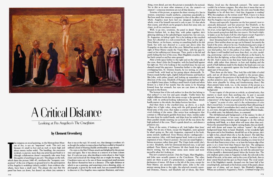
This tempera-on-wood painting, in the Metropolitan Museum of Art, is not an "important" work. This isn't just because it's small (a foot and an inch or more high and about twenty inches wide). The handling, the execution in detail, is uneven: more than one artist has put brush to it (though collaboration doesn't necessarily take away from the quality of anything in any art). The plaque on the wall, which dates the picture 1440-45, attributes the "inorganic composition" of the row of figures on ground level to the participation of Fra Angelico's workshop (which couldn't, from evidence elsewhere, have been a small one). The plaque also says that the panel has been cut down, but doesn't say where (my surmise is that it was at the top). It's noted, too, that damage is evident: it's as though the surface in many places had been scuffed or bruised or suffered a kind of blurring (hardly attributable to age alone).
On visits to the Met I'd been struck and delighted by the picture time and again. But it was always at a remove of at least a dozen feet. It's only just now, after deciding to write about it, that I went closer and noticed all the things that are or might be wrong. The Crucifixion turns out to be one of those exceptional small pictures that deliver themselves best at a distance. (The right distance at which to see a painting, and sometimes even a drawing, print, or photograph, is given by the work itself, but you yourself still have to discover it.) Fra Angelico was a supreme illustrator, and everything, every detail, put into this picture is intended to be noticed. Yet in this as in most other instances of art, the creator's—or creators'—conscious intentions are not all that decisive.
Scrutiny of the picture, as against the sheer viewing of it, has its interest, sometimes visually aesthetic, sometimes anecdotally so. But how small that interest is compared to that of the effect of the whole. Angelico must have laid out, designed, indicated that whole, even if he himself executed it only in part. It's that whole that counts, and which can be grasped a dozen feet away only, no closer, in all its conclusive unity.
Well, to go into, scrutinize, the panel in detail: There's St. Monica furthest left, in deep blue, with palms together; she's glancing sidelong at the splendid figure nearest her, her own son, St. Augustine, in bishop's garb. Nor is he looking at the crucified Jesus: he's absorbed in a red-covered book. Next on the right is Peter Martyr, on his knees, writing on something held in his left hand, but with eyes directed to a point just above John the Evangelist on the other side of the cross. Behind but mostly to the right of Peter Martyr stands the Virgin Mary, with her gaze focused on her suffering son's kneecaps. Then, partly to the left and partly hiding the foot of the cross, Mary Magdalen crouches, with her back toward us and her arms upraised.
After a little space further to the right and on the other side of the cross, there's John the Evangelist, with his hand held against his right ear. Nor is he looking at the crucified Jesus: his eyes are slanted toward the spectator. Somewhat further to the right and overlapping him, St. Dominic kneels, he too writing, in a bluecovered book, with head up but gazing almost abstractedly. St. Francis stands further right, slightly behind Dominic and barefoot like John, with palms joined, and looking up somewhere in the direction of the cross. Elizabeth of Hungary stands furthest right, on a slightly lower plane, holding a small bunch of pink and white flowers in a fold of her mantle that she seems to be thrusting forward from her stomach; her eyes are cast down as though focused on the flowers.
The horizon line of the rock surface (or does the line belong to that surface?) is very low and quite straight. Visible below the slightly different levels that the saints occupy is the greenish rock itself, with its artificial-looking indentations. But these details hardly matter to the whole; the darker horizon line does.
And then there is the crucified Jesus, up above, in a much higher key of light value, along with the gold ground and the blond arms of the cross; that makes a contrast with the dark yet vivid clothing of the saints. (But notice how undisruptive that contrast is.) Blood spurts garishly from Jesus' chest, trickles under his arms from his nailed hands, and drips from his nailed feet in three parallel streaks (starting out as four) all the way down the high pedestal of the cross. That's a garish detail too, and almost a primitive one.
None of the saints, if looking at all, look higher than Jesus' thighs. Nor do any of them, except the Magdalen, seem agitated by what's going on. But only Augustine, engrossed in his book, seems entirely unaffected. Even Monica shows—ambiguously— some reaction. John, with hand against head, looks at us with an expression of woe. Francis's posture—his eyes are raised highest— betrays reverence rather than grief. The Virgin looks stolid, she's so erect. Elizabeth, with her downward-directed eyes, is sad and subdued. Peter Martyr and Dominic lift their heads from what they're writing, but the former seems more intent and more moved by what he's looking at.
This isn't a narrative picture. Only the Virgin, Mary Magdalen, and John were actually present at the Crucifixion. The other saints are there as part of a presentation, a pageant, a kind of declaration of status. All those to the left of the cross, except for Peter Martyr, are anciently venerable saints. John is the only ancient among those to the right, the relatively recently canonized Dominic, Francis, and Elizabeth (all of whom, like Peter Martyr, lived into the thirteenth century). The newer saints couldn't be in better company. But what does it mean that two of them are busy writing? (They are also the only ones besides Mary Magdalen to be off their feet.) And that Augustine is reading? Why this emphasis on the written word? Well, I leave it to those who know more to offer an interpretation. It may be to the point that Fra Angelico was not unlearned.
Monica and especially Augustine are the best painted, most realistically delineated—and best preserved. But Elizabeth, at the other end of the panel, may be the best "passage," morceau, sheer bit of art, in her light blue gown, and so well profiled and modeled by her mantle going from dark blue into mauve. Her head is slightly faded, as are the heads of all the other figures except Augustine's and maybe Monica's: faded or blurred, rubbed, scuffed.
Jesus' drooping head is the most troublesome item in the whole picture. Here neither abuse nor age can be blamed, but mainly the hand of the artist, whoever he was. Foreshortening and a swipe of darker paint have made the face nearly chinless. Tiny, half-closed eyes lend pathos, but it's the pathos of an infant. Yet the rest of the figure is well handled (and more than that), in color, modeling, positioning—and is not too much affected, as the head is, by the fact that the lighting, as that of the whole picture, comes from the left. And it seems to me that Jesus' faulty head, as part of the whole, adds rather than detracts: its hair and shading and the patch of half-darkness made by the shadow the head casts over one shoulder come in appositely against the broad blondness of the upper part of the picture.
Then there are the halos. They look like solid disks of soiled gold, and are all shown full-face, parallel to the picture plane, without regard to the positions of the heads they belong to. That's another primitive note. (Later on Fra Angelico would make his halos more plausible by tilting and foreshortening them.) But these present halos work, too, in the interest of the picture as a whole, offering a variation on the less discolored gold of the background.
To say it again: it's the picture as a whole, as a formal unity, that matters so much more than anything else. In part it succeeds precisely because of what the wall plaque calls the "inorganic composition" of the figures at ground level. For their arrangement is "organic" in point of color, and it's the orchestration of color that's crucial here. It overcomes the somewhat blunt silhouetting of the figures (which I nevertheless don't mind in itself). Unity steals in, as it were, through the different colors and their different shades. It's a subtle unity, but definitely there, in command.
The old-fashioned gold background is of the essence: by dint of ambience and contrast, it lets every other hue contribute to the whole without losing intensity (gold manages to do this without rendering itself blank, as a sheer white will more often than not). Notice the saturated blues in slightly varying shades; they are distributed with rhyme and reason but without "system"; the off-gold background keeps them in hand. Elizabeth, in her wonderful light blue gown and in her blondness, should fall out of the picture, she's so light in key, placed where she is; but she doesn't. Her dark blue mantle, turning into mauve where she gathers it in front of her, frames and puts her in plane, as does her standing on a lower level of the rock than Francis next to her—or at least the bottom edge of her gown is on a lower level than Francis's bare feet. The ambiguous color (which I'm sure was originally brown) of St. Francis's habit is felicitous where it is, having nothing to do with the unlocated tract of dun (possibly a deteriorated green) below the horizon line. The sole emphatic green comes in Augustine's cloak, the only reds in the bands of his stole, in his miter, and in the cover of his book, then in Jesus' unreal blood and the spot on Peter's head. The vivid vermilion of the Magdalen's mantle, drooped over the lower half of her crouching body, and nearly at the bottom center of the panel, almost jumps out of plane, and yet doesn't, like Elizabeth's lightness. Whites are scattered to Augustine's, Peter's, and Dominic's gowns, and Monica's wimple; they count a lot, as white-whites usually do, for better or worse, in painting that proposes any sort of realism.
(continued on page 251)
Continued from page 113
As for the arrangement of the figures, the layout, the total organization of the picture: The saints on the left are bunched somewhat, with enough deep blues to weigh the whole down on that side. But balance is restored in a quite unmechanical, asymmetrical, yes, "organic" way. That's done by the very openness of the spacing of the figures on the right, by the "advancing" of John's and Elizabeth's mauves, and also the latter's light blue, and then Dominic's white. There's a geometric scheme: the slight forward leaning of Peter's and Dominic's blueclad bodies, with the Virgin standing behind the former and John behind the latter, makes the sides of a triangle whose apex is, imprecisely, Jesus' head and halo. (You have to stand back to see this or else narrow your eyes.) What's "inorganic" is that the heads of the standing figures are all almost on the same line. But I don't find this a fault: somehow it contributes, once again, to the total result—which is all that can be asked of any aspect or part of an artwork.
There are other strokes of design: the Magdalen's upraised right arm, almost pink, and her pale hands cutting into the golden space between the foot of the cross and John— that's part of the curious, erratic, bumbling sophistication of the picture.
Fra Angelico, with and without the help of his shop, did more splendid paintings both before and after this one, on panel and in fresco. He was one of the "progressive" artists of his time and place, advancing from one realization of verisimilitude to another, in the modeling of three-dimensional forms, in the excavation of illusioned space and the "staffing" of it. He was an utter professional. He kept up with what was going on around him in other studios, especially in Florence. That he was saintly seems not to have been in conflict with his professionalism, and why should it have been? There have been saintly ones in all the arts who were complete practitioners; saintly but not necessarily devout.
Legend would like him on the simpleminded side. According to Vasari, Fra Angelico (whom Vasari knows as Fra Giovanni of Fiesole, originally Guido di Pietro) never took up his brushes without a prayer. This, it seems to me, could mean at the least that he was as nervous as any other artist—or writer or composer—before starting work. Again, according to Vasari, Fra Angelico "would never retouch or correct his pictures, leaving them always just as they had been painted, since that, as he used to say, was how God wanted them"—this I hardly believe. To be sure, corrections, retouching, changes of almost any sort can't be easily detected in tempera, much less in fresco, whether done wet or dry. But I'm incompetent here, in any case. All the same, the evidence of Angelico's art, as art and not as technique, tells me he couldn't have painted in quite the way Vasari reports; he was, again, too professional, too much a practitioner (just as Pollock was, who likewise found himself subliminally inspired—as if all inspiration weren't subliminal in the showdown, and not just in art).
The picture at hand, this modest, unevenly executed, and worn panel, owes its stealthy beauty to inspiration, of course. Still, inspiration alone doesn't suffice without the competence, skill, there to receive it. That happened with this battered, aged painting. But do stand away in order to appreciate it, don't come too close.
Subscribers have complete access to the archive.
Sign In Not a Subscriber?Join Now


